PROJECT
Capital & Regional Brand Refresh
Capital & Regional PLC is a leading UK property REIT, specialising in community shopping centres. They currently own and operate 8 schemes with an asset value of £1 billion and attract over 80 million visits a year.
In 2018 we helped Capital & Regional to update their corporate identity; refreshing their logo, colour palette, print and digital elements to help reflect recent changes in the business. Of Colour & Code managed the project, working closely with C&R’s marketing and senior leadership teams and new CEO Lawrence Hutchings. Design was instructed to Bluedog design.
Role:
- Planning
- Project management
- Industry research & analysis
- Design agency selection, briefing and management
Design:
Bluedog Design
Project elements:
- Logo
- Brand guidelines
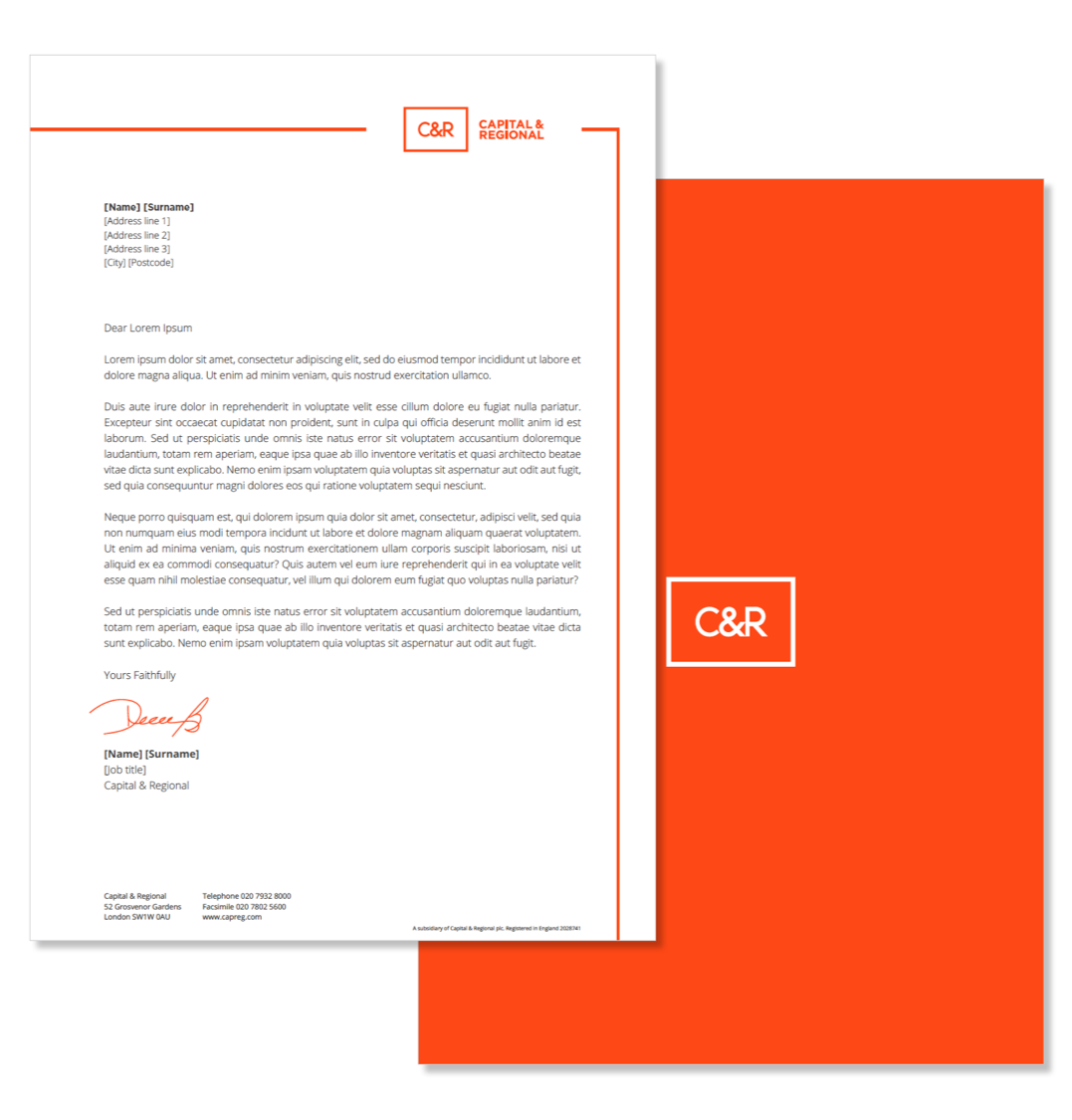
- Stationery
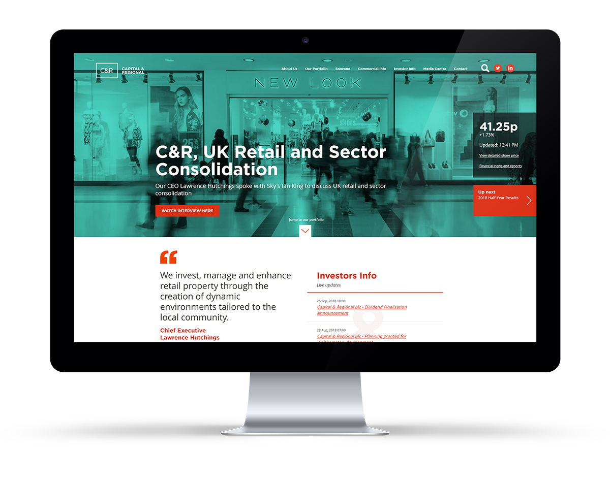
- Website
- Internal comms identity
Evolving the C&R Brand
Since the previous incarnation of the Capital & Regional brand and design language had been in use, the industry, consumer shopping habits and the fundamental shape of the business have all changed dramatically. Over the last 10 years there have been huge changes in the financial markets, new technologies arrive, operators come and go, and businesses adapting at various speeds to changing shopping habits.
A new strategy was put in place by C&R in 2017 to become the number one community shopping centre operator in the UK and it was time for the business to update how it presented itself to retailers, investors, staff and industry partners.
The brief was for evolution rather than revolution. We wanted to retain the Capital & Regional name but modernise how the business presented itself, aiming to reflect the vibrancy of C&R centres and their customers, be more dynamic and modern.
A new logo was developed with variations to allow for better use at small sizes – for example on app icons and social media avatars – and for both full and abbreviated company names as ‘Capital & Regional’ and ‘C&R’ are used within the industry.
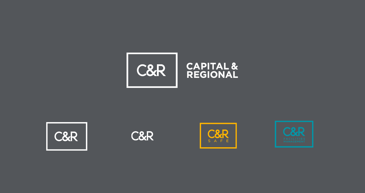
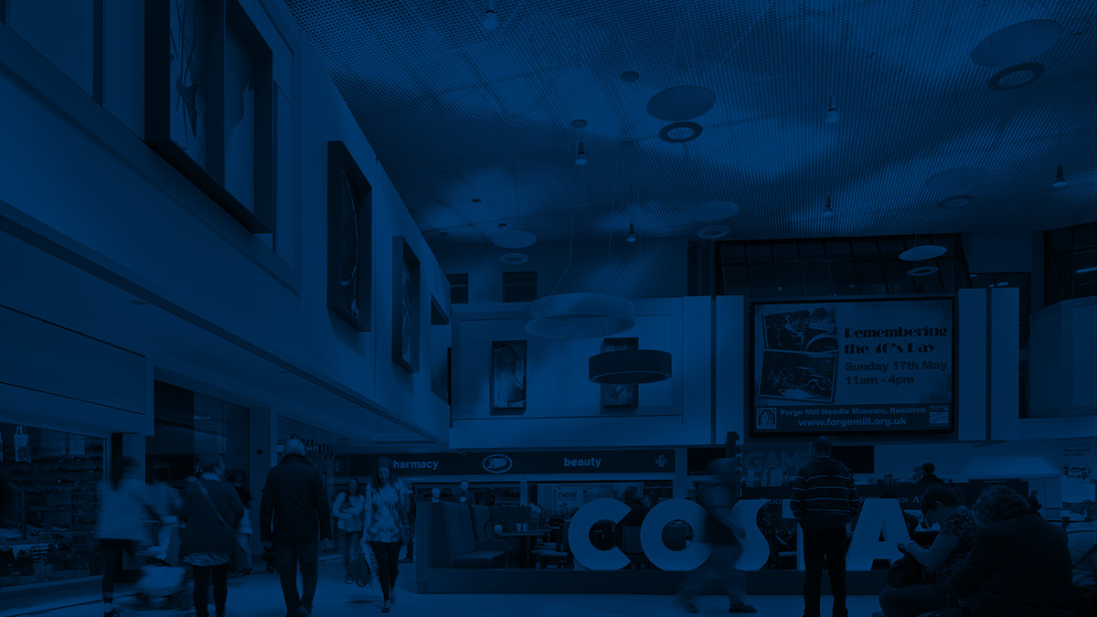
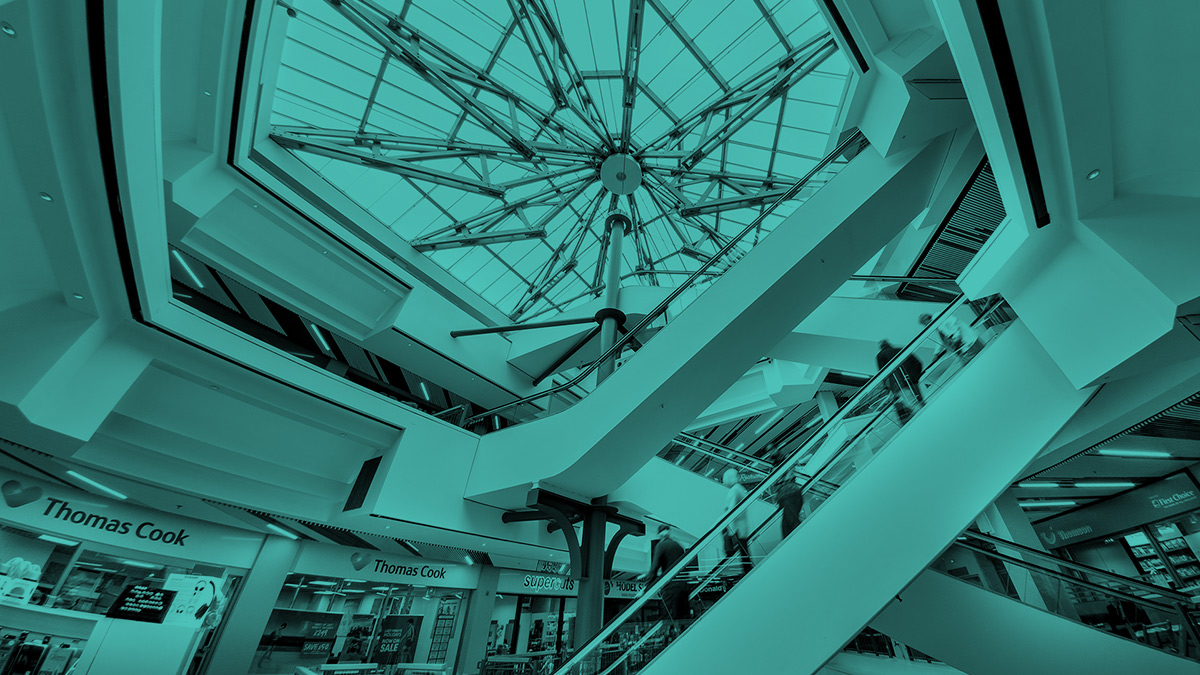
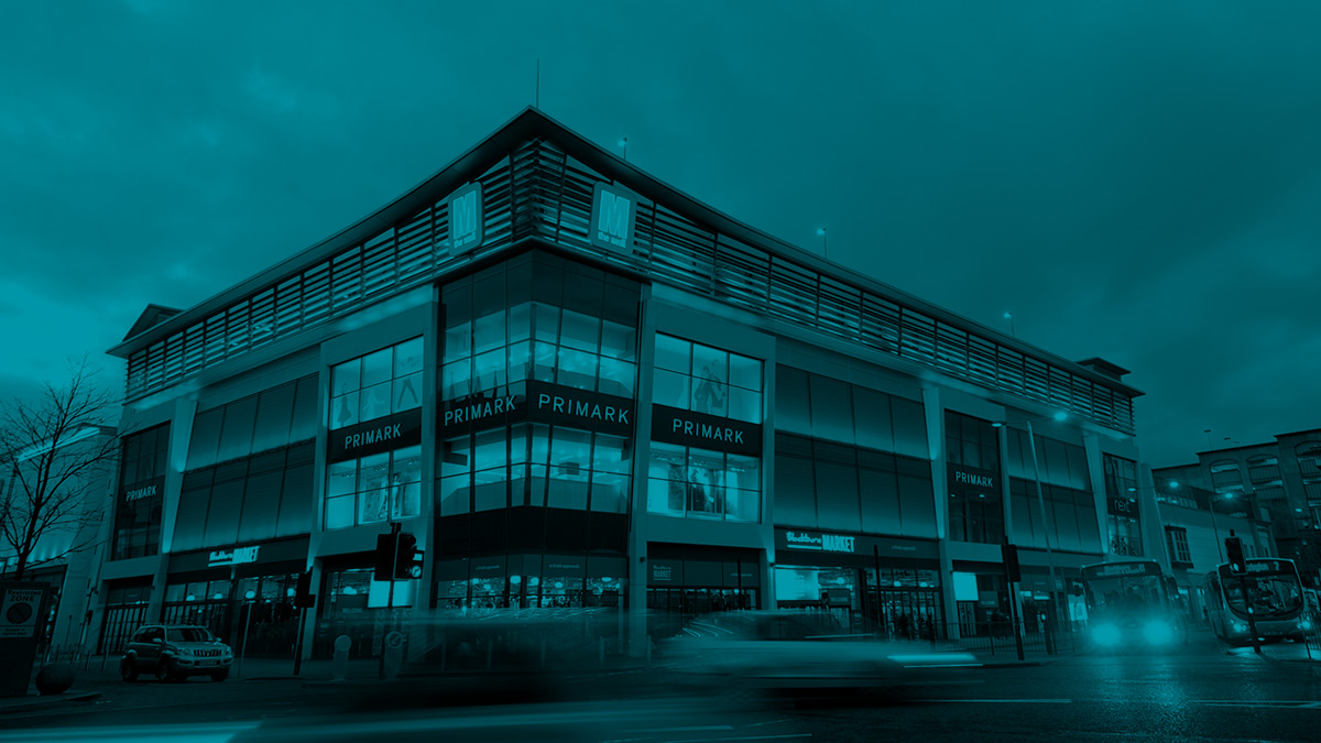
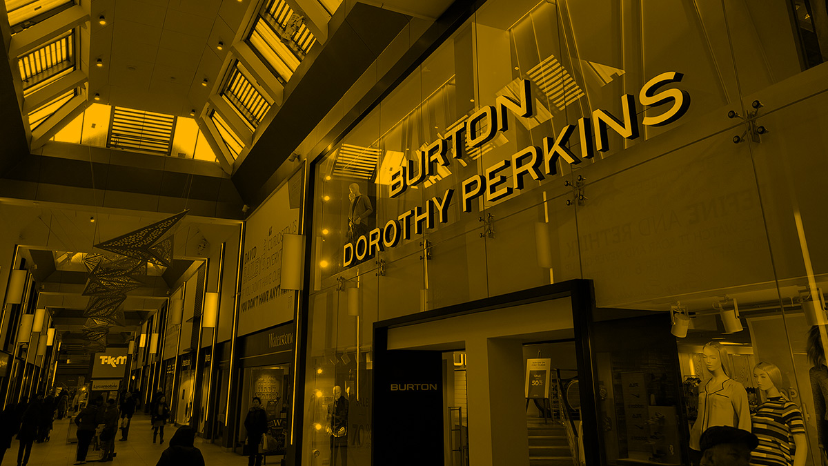
The colour palette was updated to be bolder and brighter, shifting from a reserved, financial, colour scheme to one that better reflected the vibrant assets which the company manages. The bold red was used as the primary colour with secondary palette of colours introduced to add vibrancy. The colour scheme carried across into a duotone imagery style.
For the typography Gotham Bold was selected as a strong and modern header font, with Open Sans complimenting it for longer-form body copy.