PROJECT
John Pringle Associates
John Pringle is one of the UK’s most experienced leadership coaches, working internationally with an impressive roster of clients including Unilever, Gucci, Nestle, WPP, Land Securities and various divisions of the UK Government. We worked with John to develop a new brand identity for his consultancy services and supporting materials including stationery and website.
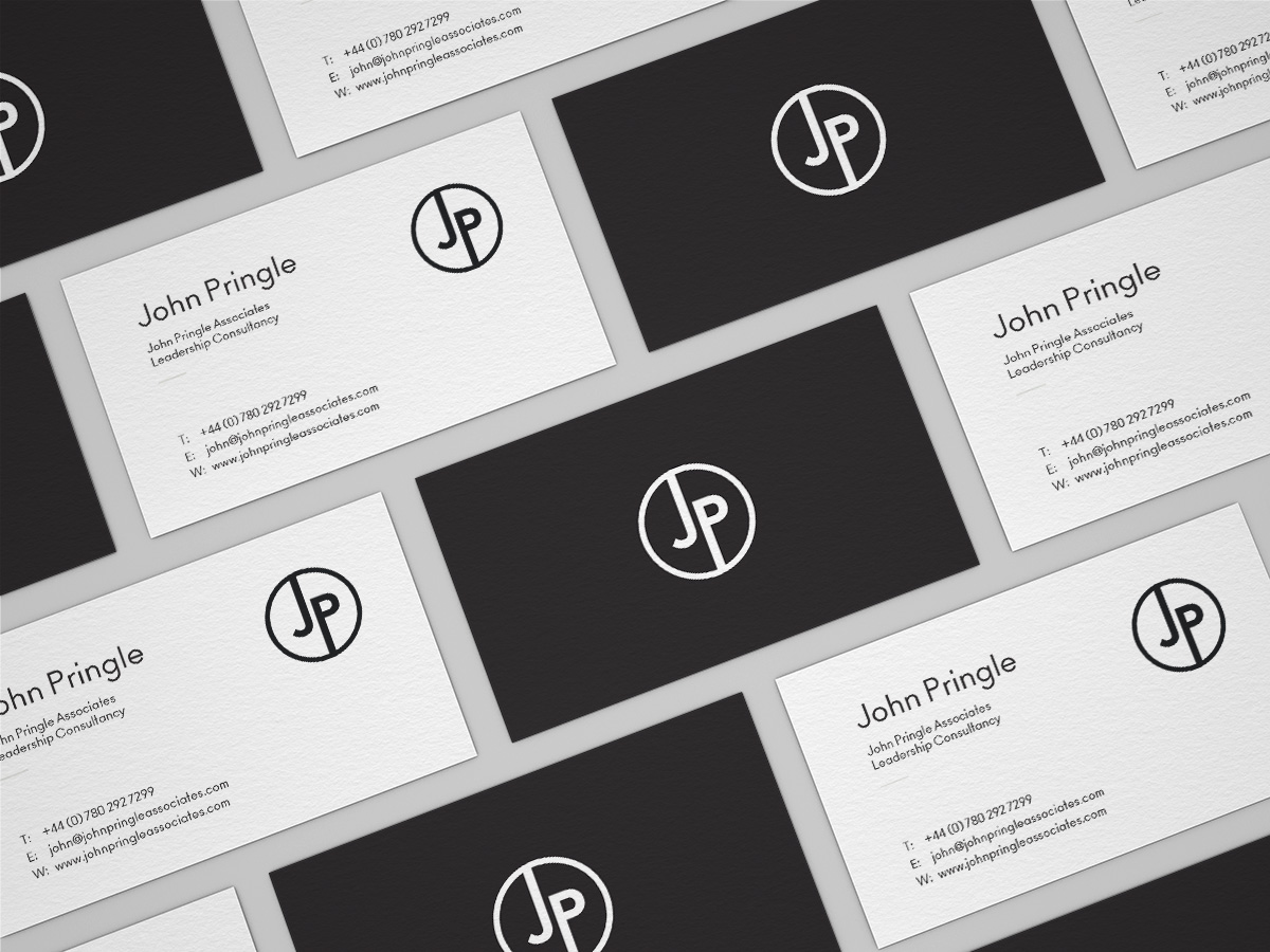
We worked closely with John to develop an identity that reflected his high caliber of work and clients. It needed to be clean, recognisable and distinguishable from others in the same industry.
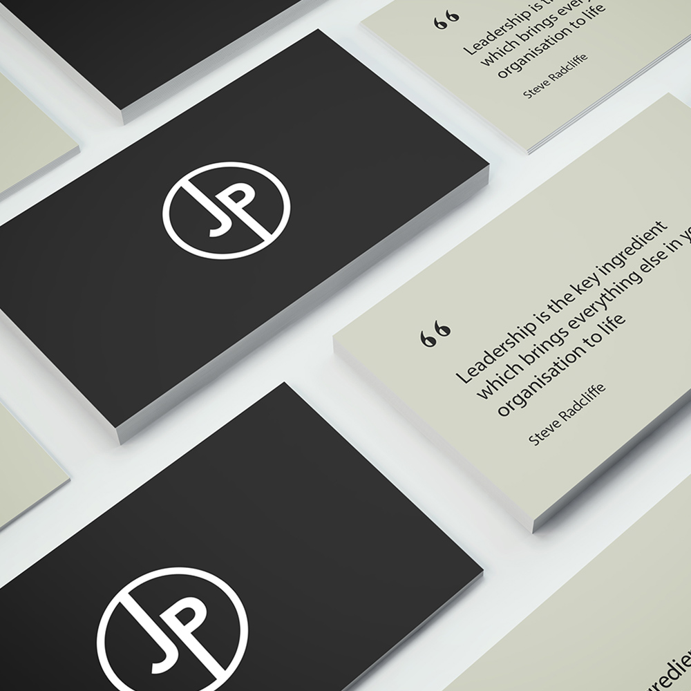
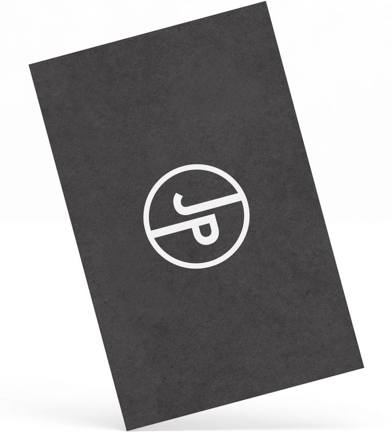
An almost-black dark grey was used alongside lots of white space to give a clean and professional look. We aimed to keep the identity simple and elegant but also personal. We started with the monogram-style logo which incorporates a circle which reflects some of the principles and philosophies in John’s work. The dark grey primary colour reflects prestige while additional colours are introduced on the website to highlight three distinct areas of work.
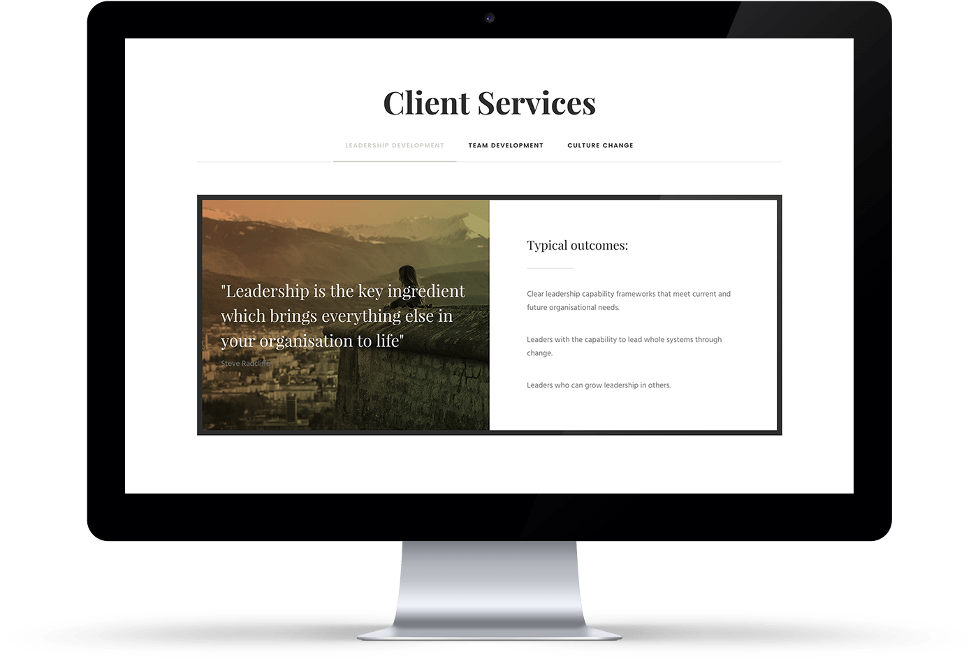
Website planning and development
For businesses like John’s, a website primarily acts as an information point for new clients, and needs to be simple to maintain. Various layouts and structures were discussed with John prior to the design stage and wireframes were developed to help develop and test content requirements. The site was built using Wordpress to provide a cost effective solution.